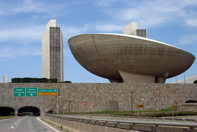
No, something tells me the answer is really neither of those, because it's the 1950's and you're barely suppressing those totalitarian urges bubbling up to the surface. Seething under your well groomed exterior is a power mad lunatic waiting to get out. You need an architectural style that speaks your language; something cold, impassive, and inhuman. Something strong and unfriendly, made of raw concrete, which does nothing to suggest a Human inhabitant. This needs to be a style that emphasizes function and little else, something as uninviting and strict as you are. What you need is Brutalism.
Brutalist architecture was at it's peak of popularity between the 50's and late 70's. The depressed post-war economy meant architects needed inexpensive materials to work with. So bare concrete immediately became associated with the style. Brutalism emphasized bold, sharp angles and tried to evoke a protective atmosphere. As a result, the buildings made in this style are fortress-like and almost uncompromising, even claustrophobic. But at the time the style was praised for it's socially progressive attitude and simplicity of forms. Brutalism's proponents praised it's "honesty".
But naturally, cold unsympathetic concrete has it's host of problems. For one thing, this style is very harsh and well...brutal. It clashes with every other architectural aesthetic in comes in contact with. Plus, all those vast blank walls are like lightning rods for vandalism. Combine this with the fact that concrete stains and fades in damp climates and you suddenly have a breeding ground for urban decay. Imagine what it would be like to live in a crumbling, rusting cube covered in graffiti and you get a sense of what it would be like.
Brutalism has attracted plenty of critics over the years. Many have come to see it as an ugly reminder of Fascist philosophy. Some like Theodore Dalrymple have gone so far as to say that these buildings are cold-hearted, inhuman, hideous and even monstrous.
I think this is part of the reason why I like it so much, specifically because it's such an evil looking style. The Brutalist style meshes so perfectly with my angry, futurist outlook and my love of all things Dalek. Some of these buildings even look like they borrow some of the visual cues from their iconic metal skirts.
It doesn't look like I'm alone on this one either. Alien conquerors the world over agree; if you want to properly oppress a civilization, you need to do it with an enormous triangular tower. Just look at the Combine Citadel...
Look at those bold angles, that scale, the way it clashes with the crumbling Soviet era housing. That is a statement in Brutalism if I've ever seen one.


